Google Refreshes Iconic ‘G’ Logo After Nearly a Decade: Embracing Gradient Design and AI Aesthetics
Google has quietly rolled out a fresh look for its iconic 'G' logo, marking the first significant update in nearly a decade. This subtle yet impactful change brings the logo in line with the company's modern design language, particularly its AI-driven initiatives. Let's dive into what's new and why it matters.
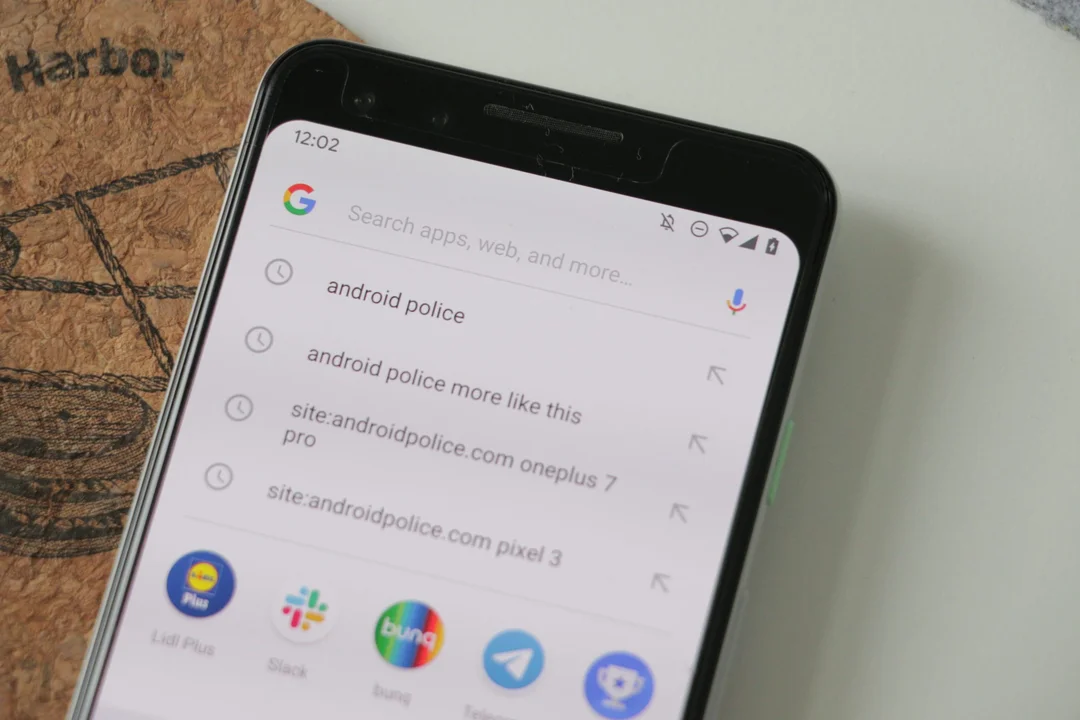
The update, initially spotted on iOS devices and Pixel phones, features a blended gradient effect across the classic red, yellow, green, and blue segments of the 'G'. Instead of distinct color blocks, the new logo sees red smoothly transition into yellow, yellow into green, and green into blue. This gradient design evokes a sense of fluidity and aligns with the visual style of Google's Gemini AI and the Search AI Mode, hinting at a broader shift towards a unified aesthetic.
The previous major logo update occurred in September 2015 when Google transitioned to a sans-serif typeface and introduced the multicolored 'G' logo we've become accustomed to. This latest iteration, while more subtle, signals Google's commitment to staying visually contemporary and reflecting its evolving brand identity.
The updated 'G' logo is currently live on the Google app for iOS and Android (version 16.18). On Android, the new logo is also visible on the app's splash screen. However, it's not yet universally deployed across all Google platforms. The web favicon, widgets, and Pixel Launcher still display the older design. Notably, Google itself hasn't officially commented on the logo refresh.
The new look is more vibrant and colorful, but it's a gentle evolution rather than a radical departure. The ever so slightly smaller G in Android’s circular app icon is one of the updates. It remains to be seen whether Google will extend the gradient design to other product logos, such as Chrome or Maps.
This logo refresh prompts a few questions. Does this signal a broader design overhaul across Google's product ecosystem? Will we see similar gradient treatments applied to other iconic logos like Chrome or Maps? And perhaps most intriguingly, what does this visual alignment with AI technologies suggest about Google's strategic priorities? Share your thoughts and observations in the comments below!