Android’s Bold New Look: Can ‘Material Three Expressive’ Win Over Gen Z?
Google is betting big on a fresh coat of paint for Android, unveiling an "expressive" new design language aimed squarely at capturing the hearts (and minds) of Gen Z. But can vibrant colors and 'fascinating' icons truly sway younger users away from their beloved iPhones? Recent leaks and reports offer a glimpse into Google's strategy, revealing a UI overhaul dubbed Material Three Expressive designed to inject a dose of youthful energy into the Android experience.
The leaked blog post, highlighting pink, purple, and coral tones and bold fonts, feels deliberately geared to appeal to a younger demographic. Google even admits to conducting 46 studies with over 18,000 participants to test the new designs, with younger users showing the most enthusiasm. As Google stated that their designs rated high in Visual Appeal and Intention to Use.

But even with the fresh interface, Android faces a formidable challenge in the US market. Apple currently holds a significant majority of phone sales, particularly among younger users. As a 2025 survey indicated, 88 percent of teenagers polled own an iPhone.
The core of the user interface overhaul builds on Material You, introduced with Android 12, offering extensive customization options. This includes adaptable color palettes derived from your wallpaper, and as suggested by one source, bolder fonts, larger icons, and more vibrant colors.

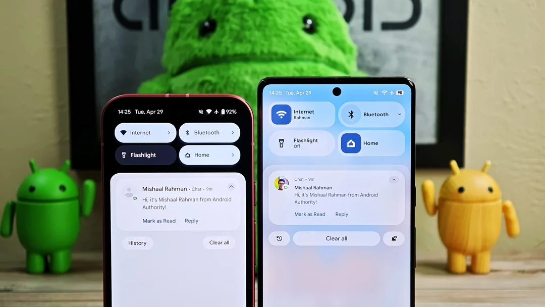
Beyond the bold colors, Google also aims to refine the overall user experience. Details have emerged about tweaks to the status bar icons, volume sliders, and even the lock screen layout for Pixel phones. Background blur effects are being introduced in areas like the Quick Settings panel and app drawer, mirroring trends seen in other Android-based operating systems. As Google stated, Material 3 Expressive principles are rooted in solid research and built on longstanding usability best practices.
While Material Three Expressive promises a visual refresh, some argue that deeper issues hinder Android's appeal to younger users. The "green bubble" stigma associated with cross-platform messaging remains a significant hurdle. Even the most visually appealing UI might not overcome the allure of iMessage and the Apple ecosystem.
The new volume UI Google is working on replaces thick sliders with thinner ones that include distinct handles.
Will Google's design revamp be enough to turn the tide? The answer remains to be seen. It's a step in the right direction, offering a differentiated experience from iOS. But ultimately, success may depend on factors beyond aesthetics, like cross-platform messaging parity and addressing the social dynamics that influence phone choices.
What do you think about Android's renewed focus on design? Leave your thoughts and predictions in the comments below!