Android’s Radically Expressive Makeover: Google Overhauls UI with Material 3
Get ready for a visual revolution! Google is preparing a major overhaul of Android's user interface, embracing a new design aesthetic called Material 3 Expressive. This isn't just a minor update; it's a fundamental shift in how Android looks and feels, promising a more vibrant and intuitive experience. Details have emerged offering a glimpse into the bold changes coming to your favorite mobile OS.
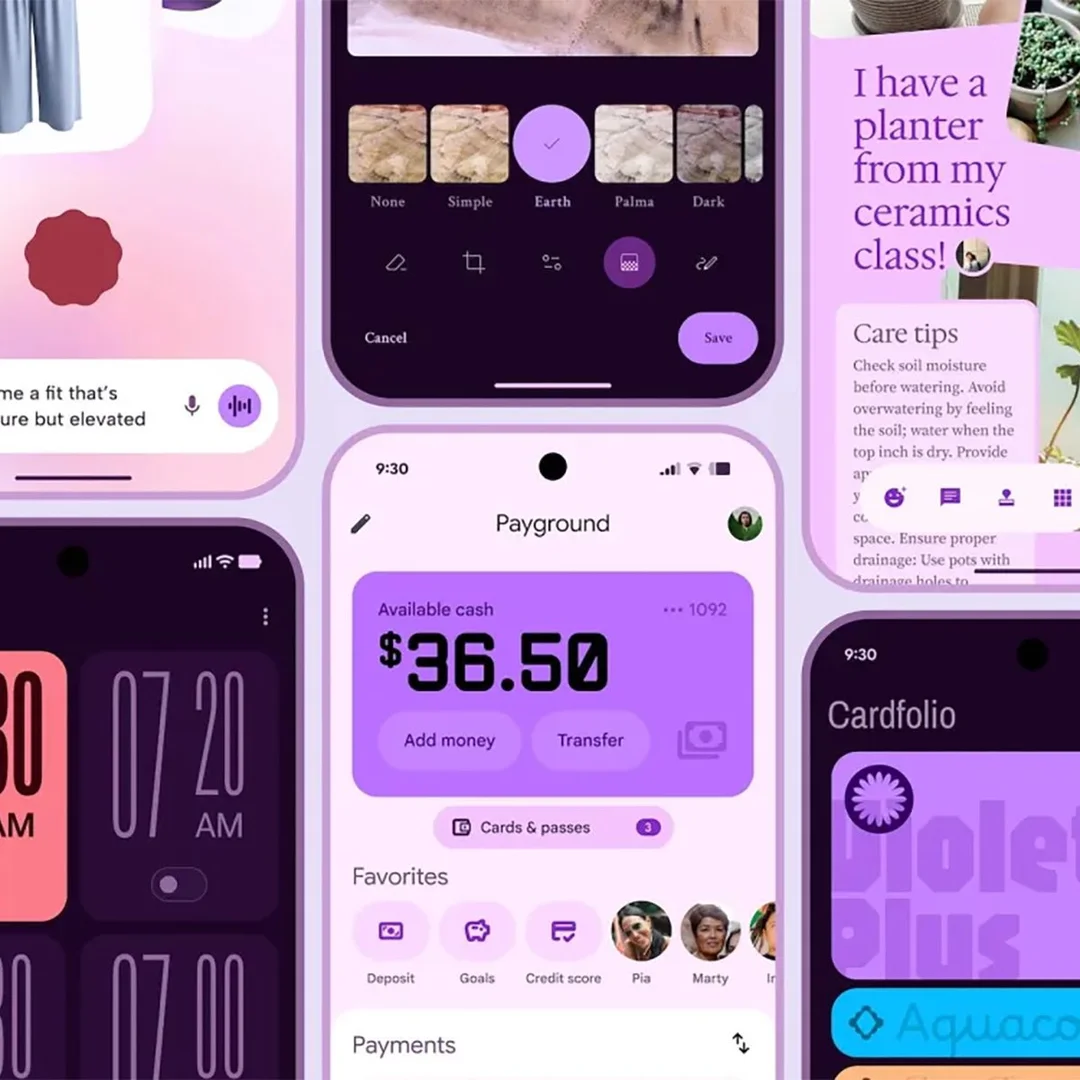
The upcoming changes address various UI elements, including the Quick Settings panel, status bar icons, volume sliders, and even the lock screen. Expect to see increased use of background blur effects, a hallmark of modern UI design, bringing a sleek and sophisticated look to Android. The new design aims to modernize the user experience, making it more appealing and user-friendly.

One notable change is the redesign of the Quick Settings panel. Instead of a solid background, the panel will display a blurred version of the content underneath, creating a sense of depth and visual appeal. The status bar icons for Wi-Fi, mobile data, and battery level have also been tweaked, with bolder and more colorful designs.
The changes aren't only skin-deep; Google is also refining the lock screen layout for a cleaner and more compact look. The date and weather information will be relocated, and a new compact notification shelf will collapse notifications, presenting only app icons until expanded. Further enhancing the visual experience, the PIN entry page receives a fresh coat of paint with dynamic colors and larger, bolder numbers.
Beyond the general OS, Google is also updating its apps to align with Material 3 Expressive. A teardown of the Google Keep app revealed a redesigned search bar with expressive design elements. The new search bar is slightly taller but narrower, with the account switcher and hamburger menu icons moved. This suggests Google is committed to bringing a consistent design language across its entire ecosystem.

According to Google, Material 3 Expressive is not just about aesthetics, but also about usability. The design principles are rooted in research studies of eye tracking, surveys, and usability testing, ensuring that the new UI is both beautiful and functional. Google says that, “Material 3 Expressive was born out of research—not in the 41 shades of blue kind of way, which delegated design decisions to data, but in a collaborative inquiry spanning research, design, and engineering.”
While these changes are still in development and may not all appear in the initial release of Android 16, they offer a tantalizing glimpse into the future of Android design. Keep an eye out for more details at the upcoming Google I/O developer conference, where Google is expected to unveil its new design language.
What do you think of these potential changes? Are you excited about the new look and feel of Android, or do you prefer the current design? Let us know in the comments below!