Google Refreshes Iconic ‘G’ Logo After a Decade: A Subtle Yet Vibrant Evolution
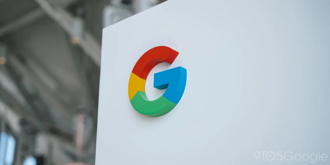
After nearly a decade, Google is subtly updating its iconic 'G' logo, marking a visual refresh that reflects the company's evolving brand identity. The change, first spotted in the Google Search app for iOS and later on Android (Google app 16.18 beta), introduces a gradient effect to the 'G' icon, blending its signature red, yellow, green, and blue colors seamlessly. This move signifies a departure from the previously distinct color blocks.
The previous major logo overhaul occurred in September 2015 when Google transitioned to the Product Sans typeface for its main 'Google' logo. This also brought about the circular 'G' icon, a design that has remained consistent until now. This new update keeps with modern design trends and might not be immediately obvious, especially on smaller screens, but the refreshed 'G' aligns visually with gradients used in other Google products, such as the Gemini logo.
The updated 'G' logo replaces the four solid color sections with a blended gradient: red bleeds into yellow, yellow into green, and green into blue. This creates a more vibrant and colorful effect, resembling some features in AI Mode in Search. While the main six-letter 'Google' logo remains unchanged for now, speculation arises whether other four-color logos from Google, like Chrome or Maps, could adopt a similar gradient approach shortly.
As Emma Roth, a news writer, notes, this subtle change could be seen as bringing the 'G' logo in line with other design elements within Google's ecosystem. The initial rollout on iOS suggests a phased approach, with wider implementation across web and other Android devices expected soon.
The update is so subtle that many users may not even notice the difference unless they are looking for it. The new design appears to only affect the small “G” logo. The full Google logo with the company’s name remains unchanged.
What do you think of Google's refreshed 'G' logo? Does this subtle change effectively modernize the brand's image, or is it too minor to make a real impact? Share your thoughts in the comments below.