Google Search Bar Widget Gets a Fresh Look: What’s New?
Google is giving its Search bar widget on Android a significant redesign, aiming to enhance user experience and emphasize customizable shortcuts. This update, following closely on the heels of the Circle to Search revamp, promises a more intuitive and visually appealing way to access Google Search and its features directly from your homescreen.
The refreshed widget, currently rolling out in the latest beta version of the Google app (16.17), sports a taller, pill-shaped design consistent with Material 3 aesthetics. The most notable change is the relocation of the optional shortcut to a standalone circle on the right side of the widget. This shift makes the custom button more prominent and easier to tap, offering quick access to user-defined actions. 
What can you customize? The options available for your personalized shortcut are extensive, including: None, AI Mode, Translate (text), Song Search, Weather, Translate (camera), Sports, Dictionary, Homework, Finance, Saved, and News. This allows users to tailor the widget to their most frequently used Google Search functions, saving time and clicks.
However, this improved experience comes with a slight caveat. The redesigned widget requires a minimum width of 4x1 to display all elements, potentially disrupting existing homescreen layouts configured for a more compact 3x1 setup.
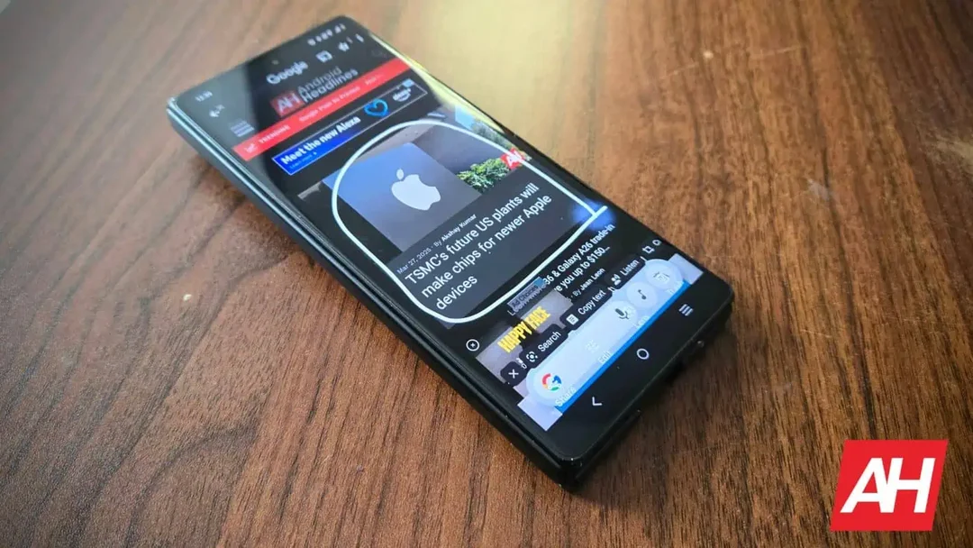
The redesign also touches on Google's Circle to Search feature. While the current version offers a long search bar, Google is testing two new layouts. One eliminates the long search bar in favor of a smaller, more compact rectangular box and also offers a light and dark version. The other keeps the long search bar but splits it into two rows featuring the 'Song search' and 'Translate' buttons on the bottom row. 
The increased visual prominence of the shortcut complements the addition of new options like AI Mode, Saved, and News, expanding the widget's utility. This expansion indicates Google’s commitment to making the Search bar widget a central hub for accessing various Google services and information. The rollout appears to be a server-side switch, so even with the latest beta, the changes might not be immediately visible to all users.
The updated widget reflects Google's ongoing efforts to refine its UI and leverage AI to enhance user experience. This is in line with the expectations for Material Design 3 Expressive, which Google will most likely showcase at I/O 2025 later this month.
What it means for you: These changes signal Google's dedication to improving even seemingly minor aspects of its Android ecosystem. The redesigned Search bar widget promises a more efficient and personalized way to interact with Google Search, potentially impacting how millions of users access information daily.
What do you think of the new Google Search bar widget design? Will these changes impact your daily phone usage? Share your thoughts in the comments below!